
Excel PivotTables for Consultants and Financial Advisors: A Step-by-Step Guide to Simplify Data Analysis
PivotTables are one of Microsoft Excel's most universal and powerful features. They are great for summarizing data from extensive tables, allowing you to filter through large datasets to find the most relevant insights. By organizing and rearranging information (or "pivoting"), Excel PivotTables highlight key statistics and trends, presenting them in a clear, concise, and easily digestible format.
Despite their intimidating reputation, PivotTables are not as complex as they seem. Learning how to create and use them effectively can significantly enhance your data analysis capabilities. In this guide, we will break down the process of building a PivotTable, demonstrating that it's simpler than you might think, also if you are a beginner.
Before we dive into the how-to, let's explore what a PivotTable is and why it can be an invaluable tool in your data analysis toolkit.
Work Faster with Accelerate Excel
Simplify your Excel work with the Accelerate ribbon comprising tools for M&A Transaction/Deal Advisory, FDD and other Excel power users.
What is a PivotTable?
A PivotTable is an important tool for summarizing and analyzing large data sets. It not only summarizes extensive data into a more manageable format, but it also allows users to interact with the data to uncover trends, highlight outliers, compare metrics, and more, regardless of their knowledge of data science.
By definition, a PivotTable is a data visualization tool used to extract valuable insights from raw data. PivotTables are available in most spreadsheet programs such as Microsoft Excel and Google Sheets. They allow you to group, filter and rotate data to view it from different perspectives, making it easier to draw meaningful conclusions.
When you create PivotTables , you don't change the original data set but rearrange it to create clarity and show important patterns and relationships. Whether you want to track totals, compare values or identify trends, PivotTables transform the overwhelming amount of numbers into an understandable and actionable format.
Why Should you use PivotTable?
PivotTables are a powerful tool when you need to aggregate and analyze large amounts of data or new data quickly. So why should you use them? Simply because they are super easy to use and provide you with quick insights.
Let's say you receive a dataset containing sales and quantity data by product, customer, and region, and you need to figure out the total sales by product and identify which customer accounts for the highest percentage of sales. Using a PivotTable can get you this information in seconds.
To sum up why you should use PivotTables:
Easy to build
Quick insights
Data comparison
Create reports
Simplifies data analysis
Identifies trends
Using PivotTables essentially makes large datasets more manageable and understandable, helping you save time and effort in data analysis.
How to Create a PivotTable?
Now that we understand what PivotTables are and why they're useful, let's explore how to create one. Here's a step-by-step tutorial on building a PivotTable. You can use data from an internal Excel Table, source file, data range, or Data Model, but data preparation is essential regardless of the source.
Step 1: Data Preparation
Start by ensuring your data is well-organized:
Arrange data in proper rows and columns
Place category names in the top row as headers
Use descriptive headers (e.g., "Revenue" instead of "Rev")
Remove any empty columns and rows
Avoid any duplicate column headers
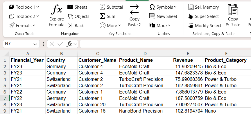
Example of a well-structured data set, ready forPivotTable input with clear headers and organized rows and columns.
Step 2: Insert the PivotTable
Once your data is cleaned, you can insert the PivotTable. Navigate to the Excel ribbon and select Insert > PivotTable.
You can then choose if you want to add the PivotTable on a new worksheet or an existing worksheet. I would always recommend using a new sheet for your Pivot.
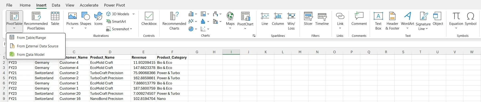
Insert a PivotTable via: Insert > PivotTable
A. From Table/Range
The simplest way is by choosing From Table/Range after selecting your data range. However, for a more efficient method, convert the range into an Excel Table first via Insert > Table. This allows Excel to automatically include new data in the PivotTable, simplifying updates. Rename the table, like "SalesData," for easier management. This ensures that any new data added is automatically included in your PivotTable.
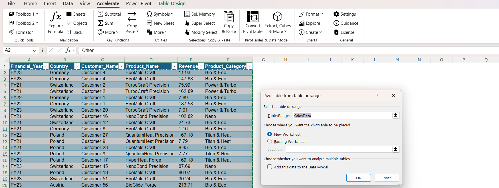
Example inserting a PivotTable from Table/Range using SalesData table
B. From External Data Source
You can also create a PivotTable using data from external sources, such as SQL databases, online services, APIs, cloud storage, BI tools, and other files. The advantage of this method is that data is accessed via a connection, which keeps the file size relatively small. This approach is efficient for handling large datasets, as the data is not stored directly within the Excel file, allowing for quicker updates and better performance.
C. From Data Model
You can also use a Data Model as a source for your PivotTable. This approach is useful when working with multiple related tables or complex datasets. By leveraging the Data Model, you can create relationships between different tables and perform more advanced data analysis. You can read more on DataModels in this article.
Step 3: Setup the PivotTable View
After completing the previous step, the PivotTable Fields panel will appear on the right side of the screen. This panel is used to construct your PivotTable. At the top, you'll see the PivotTable field list. The items correspond to the column labels in your source data.
You can drag these fields into different areas such as rows, columns, values, or filters to structure your PivotTable and display your data accordingly. The rows and columns areas represent how data will appear, while the values field is used for calculations. By default, values use a "Sum" calculation, but this can be changed in the dropdown of the value field and then navigate to value field settings.

Using PivotTables in Consulting / Financial Advisory
Let’s dive into why PivotTables are a go-to tool in consulting and financial advisory work. Imagine you’ve just been handed a dataset on a new project you’ve never seen before. A PivotTable is your best friend here - it’s a quick way to get a feel for the data by summarizing it and helping you understand the different columns at a glance. Plus, it’s incredibly flexible. When a client sends an updated data dump, instead of reworking your entire summary with something like SUMIFS, you can simply update the PivotTable data and refresh the PivotTable - boom, done.
But while PivotTables are fantastic, especially in the fast-paced world of consulting, they come with one big downside: formatting. From a consultant’s perspective, their limited formatting options can be a headache, especially when preparing polished, client-facing reports. To get that clean, professional look, you often need to manually tweak the PivotTable or convert it into a regular Excel sheet using OLAP tools, which still require additional formatting. This lack of built-in flexibility can be time-consuming and involve quite a bit of manual effort.
How Does Accelerate Excel Facilitate the Formatting Process of a PivotTable?
When using Excel’s native functions, like OLAP, the Cube formulas come without any formatting or grouping for different hierarchy levels. This means you’re stuck doing extra manual work - adding SUM or SUBTOTAL functions, adjusting subtotal lines, formatting numbers, headers, and more. If you’re dealing with a massive output table that’s packed with granularity, this can quickly become a tedious and time-consuming task.
That’s where Accelerate Excel steps in as a game changer. With its Convert PivotTable tool, you can automate all that formatting work, saving you a significant amount of time and effort. Instead of wrestling with manual adjustments, Accelerate Excel handles everything for you, delivering a client-ready table in just a few clicks. Learn More.
Additionally, the Format PivotTable tool allows you to simultaneously apply standard PivotTable design properties, making it ideal for quickly applying consistent settings across multiple PivotTables. Learn More.
Best Practices and Helpful Tips & Tricks
Tip 1: Use Slicer
Instead of using traditional filters, consider adding slicers. Slicers function similarly to filters but provide a more intuitive, visual interface, making them easier to use and understand, especially for clients or team members who may not be Excel experts. To add a slicer, go to the PivotTable Fields panel, right-click on the element you want to use as a slicer and select “Add as Slicer.”
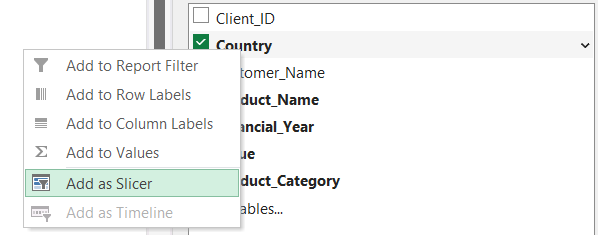
Add a slicer via PivotTable Fields panel in just a few clicks
Tip 2: Sort the Data
You can sort the data in a PivotTable by right-clicking on any row and selecting Sort. Alternatively, you can manually sort rows by using Ctrl + X to cut and Ctrl + V to paste. This method allows you to rearrange data without breaking the PivotTable structure, though it's a lesser-known technique. Sorting can help present your data in a more logical and readable order, enhancing the clarity of your analysis.
Tip 3: Adding Extra Dimension
If your dataset includes a revenue column and a costs column, you can add a new column for margin by using calculated measures. To do this, go to the PivotTable panel, click on Values, and select Value Field Settings. From there, you can create a new calculated field by defining a formula that calculates the margin (Revenue - Costs). This allows you to add more analytical dimensions to your PivotTable , providing deeper insights into your data.
Tip 4: Insert Timeline
For data containing date fields, you can use a Timeline to filter your PivotTable by specific periods. Go to the Insert tab, click on Timeline, and select the date field. This interactive visual tool makes it easier to analyze trends over time.
Tip 5: Change Design
Customize your PivotTable's appearance by clicking on the Design tab. You can choose from various styles, enable banded rows or columns, show or hide subtotals and grand totals, and change the overall report layout to better suit your presentation needs. For a more logical structure, we recommend using Compact View, displaying subtotals below each group, and excluding empty rows to simplify analysis and enhance readability. Additionally, consider including a Grand Total for rows or columns only when it adds meaningful insights to your analysis.
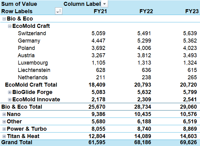
PivotTable Sample Design for better readability
Tip 6: Add PivotChart
You can improve your data visualization by adding a PivotChart. Go to the Insert tab and select PivotChart. The chart is dynamically linked to your PivotTable, so any changes made to the PivotTable are automatically reflected in the chart.
Tip 7: Copy PivotTable
If you need multiple views of your data, you can easily copy your PivotTable. Simply select the table, copy it, and paste it elsewhere in the workbook. This allows you to retain the original view while exploring additional perspectives.
Tip 8: Refresh and Update
When new data is added to your source, you can refresh your PivotTable easily. If your source is an Excel Table, Data Model, or source file, select PivotTable Analyze > Refresh to automatically update the PivotTable. Using a table range or Data Model is recommended, as it adjusts the ranges automatically with new data. If your data source is a fixed range, you must manually adjust the range to include the latest data before refreshing.
You can update a single PivotTable by selecting Refresh in the Data group or by pressing Alt + F5. Alternatively, right-click the PivotTable and choose Refresh. To refresh all PivotTables in the workbook, go to the PivotTable Analyze tab, select the Refresh arrow, and choose Refresh All.
Tip 9: Delete PivotTable
If you need to remove a PivotTable, you can do so without affecting your original data. Simply select the PivotTable and press delete. Your underlying dataset will remain intact, so you can safely experiment and modify your PivotTables as needed.
Tip 10: Collapse and Expand all fields in the Hierarchy
You can expand or collapse all fields in a hierarchy at once by right-clicking on any field label and selecting "Expand Entire Field" or "Collapse Entire Field" from the context menu.
Tip 11: Prevent Auto-Formatting changes
To maintain consistency in your PivotTable, we suggest preventing Excel from automatically applying formatting changes. Go to the PivotTable Options, navigate to the Layout & Format tab, uncheck the option for "Autofit column widths on update," and check "Preserve cell formatting on update". This ensures your formatting remains intact even after refreshing or modifying the data.
Tip 12: Show Empty Values as Zeros (0)
We suggest using the option to display empty values as zeros in your PivotTable, as it helps improve clarity for readers. Go to the PivotTable Options, select the Layout & Format tab, and check the box for "For empty cells, show." enter "0" in the field to ensure your analysis appears complete and clear without any blank cells.